Monday, July 30, 2012

Carrier Pigeon Answers Your Questions: Part 1


A look at what we do, courtesy of Tag Collective

To whom it may concern,


I have a field across the street from my house and noticed a pigeon sitting in the middle so I investigated. After walking up to the pigeon it didn't try to flee but let me pick it up. When I noticed a green band around its ankle with a four digit number. I suppose it is someone's carrier pigeon that is lost or resting? I put it in a box with rags, water and peanuts for the night.


Could you please send me some info? as to whom I should contact to return it?


Thank you in advance for any help you can offer,


Regards, Brian Kampersal


/////////


Dear Brian,

You must have a way with animals. We're pleased to hear that you were able to give some small comfort to an out-of-work/retired/bored carrier pigeon. And we are curious: did you remove the peanut shells? Pigeons in New York eat pretty much anything—entire corndogs—but it seems like the shell would be a possible impediment.

As much as we read your letter with interest, you were a little vague about where you live, so we're not sure to whom you should be referred. The Humane Society's Animal Rescue Team? The Animal Humane Society, which is not the same thing? Don't call PETA. They'll just kill it.

In addition, don't call us. We're just a magazine! We publish fiction, illustration, and fine art. We use the carrier pigeon as our mascot, because we like to draw it. To be honest, the pigeon often suffers in our drawings. We, like PETA, could benefit from being more humane, although we, unlike PETA, didn't liken butchered cows to Holocaust victims. Thank you for reminding us all to be gentle. And buy an issue!

Love,

Carrier Pigeon

This is not what we do.

Thursday, July 19, 2012

Carrier Pigeon as Metaphor for Societal Provenance

Forgive us for sounding like braying behemoths of counter culture in this post, but it's not our own assertion. This past year Christine Dengel wrote a paper, as part of her requirement for the Library and Science graduate degree program at Queens College, on her humanist approach to archival theory, and our publishing values interested her enough to become something of a focal point within the essay. What follows is an overview of the essay, punctuated with pages from the unedited proofs of two of our most recently available issues and one still in production. Hopefully, they will provide a meaningful response/parallel to her words.

She begins by considering whether the tokens left behind to us by loved ones are meaningful or functional, is brave enough to openly yearn for the dynamism of feedback from a "posthumous letter, authored by an immortal voice," and then applies "traditional notions of provenance" to the collection she inherited from her mother.

She also applies them to us. Carrier Pigeon is defined by Christine as a "society" whose creator history "cannot be defined as a single word, or even persons" but explains that "the overall effect is of an artist community that shares itself and encourages interactivity from its audience."

At left: the right side of the introductory spread for Erin Browne's "Good Dog," a short play illustrated by Marshall Arisman and containing a QR code to a short film adapted from the play. At right: an installation shot from the portfolio of Adam Lister, showing a magnetic sculpture similar to the one supplied in paper, DIY form to all buyers of issue no. 7 (available Fall 2012).


On the physical nature of our our content:
"They create content that is ephemeral in nature, almost resembling a scrapbook, yet they are objects of high value at low cost. Each magazine includes a fine art print, hand signed and couture."

At left: issue no. 5 page from "Cut in Half" by Althea Hanke-Hills, illustrated by printmaker Frances Jetter. At right: issue no. 6 introductory page for Tatiana Simonova's portfolio.


End pages from Carrier Pigeon issue no. 5 by printmaker Evan Summer.


On our method:
"The artist alone determines the content, and the magazine as medium is a neutral megaphone. . . . There is an interplay between a collective social memory and each member's personal memory."

At left: a page from painter Greg Crane's portfolio in issue no. 6. At right: an issue no. 7 illustration for "What the Fire Cost Us" by Nick Kolakowski, illustrated by Myles Karr.


On our contributors:
"The community of participants involved with the magazine are not conveniently bound entities."

At left: a page from the issue no. 7 portfolio of Hye Young Shin, documenting a foot-washing performance. At right: a detail from the issue no. 5 portfolio of Ilse Schreiber-Noll, collected from an artist book exploring her own response to the present revolution in the Middle East.


 On our mission:
"These artists react to the social inertia of the many social constructions of the New York City artist gallery world. They are developing new rituals and more flexible and inclusive frameworks; this magazine reflects that attempt."

Two pages from Carrier Pigeon issue no. 6. At left: the introductory page to the portfolio of Cannonball Press founders Mike Houston and Martin Mazorra. At right: the title page for "Feather," written by Mike Posillico and illustrated by comics creator Josh Bayer.


On our effectiveness:
"They are deliberately behaving unconventionally, and the effect is fractured and convoluted . . . archivally speaking. Their efforts reflect a changing zeitgeist where there is more blending and less chronological delineations."

We'll take it! Thanks to Christine for generously including us in her academic experience, and for sharing the results with us. Her full paper can be downloaded here.

Friday, June 1, 2012

Poets & Etchers

The following was written for us by Stephen Fredericks:


Unprecedented and remarkably unique collaborations between American artists and progressive independent publishers during the last quarter of the 19th century—which featured original art work—were the forerunners of magazines like Egmont Ahren’s early 20th century Playboy. The first of these artist driven ventures to achieve widespread commercial success was Poets and Etchers.
The first edition of Poets and Etchers, copyrighted in 1881, was released in early 1882. The publication, which incorporated original etchings created by members of the New York Etching Club, was an instant success and almost immediately went into a second printing, followed by a third and possibly fourth edition. However, the genesis of this sensational project—organized by America’s first artists etchers lay in inspiration from many years earlier.
In 1866 a young American artist named Henry Farrer saw an exhibition in New York City of etchings by largely contemporary European artists. The show was produced by a Frenchman named Cadart under the auspices of the French Etching Club. The exhibition and a second mounted in 1868 were both presented in a gallery at 625 Broadway. Farrer was so inspired that he built his own etching press to begin printing his first etched plates.
Following the 1868 exhibition Cadart collaborated with publishing professionals Verlaine, Paul, and Lemerre in Paris and helped produce Sonnets Et Eaux-Fortes (Poems and Etchings) in 1869. Printed in an exceptionally deluxe edition of 350 copies this remarkable and popular project featured etchings by Corot, Daubigny, Manet, Gerome and Dore, among many others. 
Henry Farrer, Twilight—5" x 7"

No doubt Henry Farrer soon knew of this publication and, in my estimate, eventually had a chance to study one; for, about a decade after its release, Farrer succeeded in enlisting the participation of four other early members of the New York Etching Club in a similar project published by Osgood & Co., of Boston, Massachusetts, not-coincidentally titled Poets and Etchers.
One of Farrer’s collaborators in the publication was fellow artist-etcher James D. Smillie. Smillie, whose diaries have been preserved by The Archives of American Art, kept detailed records of many of his artistic endeavors. On November 3, 1880, Smillie noted that,“Farrer, Bellows & Colman called—much interested in etchings & proving paper.” Each of these artists and a fourth, Robert Swain Gifford, were the eventual artist-illustrators of Poets and Etchers. On November 13 Smillie recorded that "Farrer brought his four etchings for the Osgood book," and on November 29 he further noted: "then to 51 W. 10'S"—with Farrer’s 'Poets & Etcher's' Jap. P.fs for his autograph.” Henry Farrer must have had Smillie, who had his own etching press, proof the above-referenced plates.
James D. Smillie, Nocturn—8" x 6"
Between Henry Farrer and his colleagues James D. Smillie, A. F. Bellows, Samuel Colman, and R. Swain Gifford they produced twenty original etchings to accompany poetry by such distinguished poets as Ralph Waldo Emerson and Henry Wadsworth Longfellow. A later diary entry by Smillie suggested a high level of satisfaction with the success and quality of this exquisitely executed and seminal "artist’s book" project. This collaborative effort between publisher, artist and poet in the publication of Poets and Etchers marks the first such successful commercial event of this type—incorporating copies of original prints—in American history.
By today’s standards, some of the original prints in Poets and Etchers may appear a bit primitive to some, but in their day they were state-of-the-art artist etchings. Similarly, the subject material in a number of these Victorian era etchings, created to accompany period prose, may seem understandably remote, but they were all the rage 130 years ago. Had these artists not initiated this publication—and several similar projects that would soon follow—the shape of artist printmaking, fine art publishing for a mass market, and the greater art world at the turn of the 20th century would have been quite different. Today, intact copies of Poets and Etchers, while not commonly available, may be found on line at auction for as little as $60—a remarkably good buy and investment. 

A. F. Bellows, Telling the Bee—7 1/4" x 5 1/4"
Samuel Colman, The Belfry at Bruges—4 1/2" x 3 1/2"
Robert Swain Gifford, Palestine—5 7/8" x 3 3/4"

Tuesday, January 31, 2012

Chomping at the bit of CP Vol 2

Today is a proofing day, and I thought I'd share the bones of the process. Some of you may not realize how far ahead a quarterly publication has to be thinking. At Carrier Pigeon we add additional challenges to an already daunting task by featuring fully illustrated short works of fiction, which means giving the illustrators time to do their jobs. While the illustrators are toiling away at their drawing boards to come up with five to 10 complementary images for each assigned work, we're busily formatting and copy-editing, going back and forth with the authors to reach approved versions that are clean while maintaining the authors' voices.

Once the designer has laid out the magazine with the approved text and we're able to see a hard copy it's time to address issues of consistency across the magazine. This really can't happen on a screen. In addition to being lucky enough to have had illustrations commissioned for several issues, I act as the gatekeeper where these things are concerned. I hold the proof copy in my hands, scribble notes, twist my fists, go through rounds of changes with the issue designer, and then sleep in the knowledge that everyone's hard work will pay off and no one will have to bear the public embarrassment of having written "waist" instead of "waste." Even the tiniest issues with consistency among the punctuation of six pieces of fiction per issue by six writers—plus six artist statements and artwork descriptions—can have an effect on the reading experience, which is as important as the viewing experience. In order for the magazine's audience to be immersed, or even, hopefully, once in a while, transported, the whole thing has to be seamless, and the collaborators have to trust that each will do their parts.

Enjoy this tiny sneak peek of our Spring 2012 issue—in process but with no mistakes highlighted, obviously—and don't forget to join us on February 23 for our Vol. 2 issue 1 release exhibition party at Grit N Glory boutique.

Reference notes to back up marks generously applied to the magazine body


Sloth by Matthew Blair, illustrated by Kristy Caldwell (me)

No proofing required. Thanks to the awesome guys at Cannonball Press.

Tuesday, August 2, 2011

AVANT GARDE Magazine

During the 20th Century there were a number of publications that combined art, literature, and occasionally commentary contemporary to their times – but, it is hard to imagine one more influential or memorable than the short-lived AVANT GARDE lead by its notorious editor and activist Ralph Ginzburg.


AVANT GARDE
was published from just late 1968 until the summer of 1971. Publication was ceased largely because Ginzburg went to prison for an obscenity conviction related to his EROS magazine. There were only fourteen issues of AVANT GARDE. The best remembered among them were those including texts by Norman Mailer, Arthur Miller and Peter Schjeldahl; and the issues incorporating John Lennon’s erotic lithographs, Picasso’s erotic gravures, and Bert Stern’s day-glo serigraphs of Marilyn Monroe.


Bert Stern’s then experimental prints of Monroe were based on his now iconic photographic study of her shot at the Bel Air Hotel in Los Angeles in June 1962. Monroe was dead a couple of years later never having posed again for such an essay. Stern remained “preoccupied” with her though and created the stunning serigraphs authentically reproduced in AVANT GARDE some five years after Monroe’s death.


The twelve-page spread of Stern’s prints appeared in Issue 2, March 1969. The feature was entitled “The Marilyn Monroe Trip”, and brilliantly laid out on the magazine’s 11”x11” pages. Both the cover of the magazine and the serigraph reproductions were printed in a process known as ‘sheet fed gravure’ which was exceptionally well-suited for duplicating the multi-screen original serigraphs.


Announced in this issue was the magazine’s “NO MORE WAR” poster contest the results of which were published in Issue 5. Among the judges of the contest entries were photographers Richard Avedon and Edward Steichen, printmaker Leonard Baskin, sculpture Alexander Calder, and artists Milton Glaser, Robert Motherwell and Larry Rivers.


Also included in the March 1969 issue was the very cool fiction piece “The Visitor”, by Roald Dahl which first appeared in a condensed form in Hugh Hefner’s Playboy Magazine in 1965. Dahl’s short story was illustrated with drawings by Etienne Delessert whose distinctive, sometimes edgy and always clever graphic art ranks among the best of his day.


Issues of AVANT GARDE, fortunately, are not particularly rare today and can be found in used book stores and on-line, often, in the $10-$20 range for copies in fairly good condition. A value, I believe, not to be overlooked at these prices for the remarkable quality and enjoyment this cultural arts oriented publication will bring over and over again.

--Stephen A. Fredericks

Wednesday, April 20, 2011

Let Carrier Pigeon be the fly on your digital wall.

Remember the first time you saw all ten editions of Carrier Pigeon issue no. 2's hand-silkscreened covers glistening in front of you? Remember the turmoil in your gut as you carefully chose a favorite, counting out your milk money in a cold sweat?

As a show of thanks to all of our friends, supporters and contributors, Carrier Pigeon would like to offer up a series of desktop wallpapers created from these covers. Each image has been carefully augmented to look terrific within the screen ratios and sizes available to our digitally-yoked generation of laptop swindlers. This means if you download two sizes of the same cover, there may be surprising and delightful differences. The images below are thumbnails of the 1024 x 768 version of each wallpaper.

The dimensions listed below are in pixels. Click the dimensions that best fit your computer screen to view/download the corresponding desktop wallpaper image.

Click the artists' names for life stories, past histories and current mugshots. And if you like what you see, consider picking up an issue of Carrier Pigeon from our website or any of the stores that carry us. Issue no. 3 will arrive in late Spring.


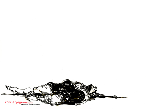
Bruce Waldman:
1920 x 1200 | 1440 x 900 | 1280 x 1024 | 1024 x 768


Christopher Darling:
1920 x 1200 | 1440 x 900 | 1280 x 1024 | 1024 x 768


Denise Kasof:
1920 x 1200 | 1440 x 900 | 1280 x 1024 | 1024 x 768


Justin Sanz:
1920 x 1200 | 1440 x 900 | 1280 x 1024 | 1024 x 768


Kristy Caldwell:
1920 x 1200 | 1440 x 900 | 1280 x 1024 | 1024 x 768


Matt Barteluce:
1920 x 1200 | 1440 x 900 | 1280 x 1024 | 1024 x 768


Ray Jones:
1920 x 1200 | 1440 x 900 | 1280 x 1024 | 1024 x 768


Rie Hasegawa:
1920 x 1200 | 1440 x 900 | 1280 x 1024 | 1024 x 768


Russ Spitkovsky:
1920 x 1200 | 1440 x 900 | 1280 x 1024 | 1024 x 768


Stephen Fredericks:
1920 x 1200 | 1440 x 900 | 1280 x 1024 | 1024 x 768


Bruce Waldman (back cover):

Sunday, April 17, 2011

What is the equation for an interactive experience that sends you flying?

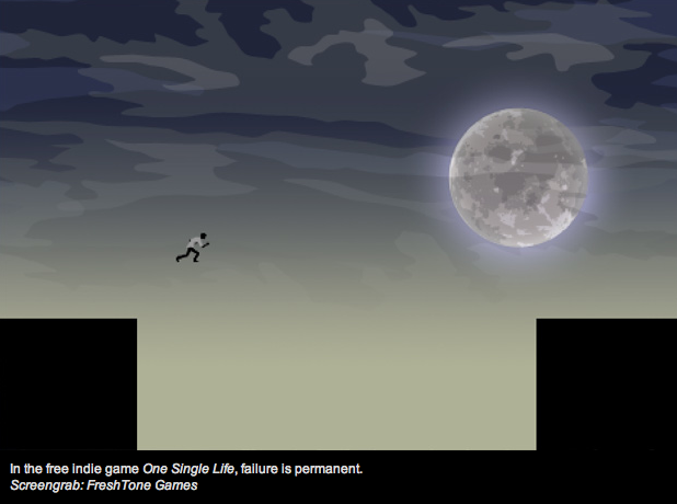
This screen grab from wired.com.


I was reading this article about an iphone game whose sole draw is that once the character dies, he is dead forever. Not even just for the game, but for the life of the application. The argument in favor of this kind of experience is that contemporary video games have become too easy and that having more at stake will induce real-life emotion in the player and so be more rewarding.

It's a compelling argument. The primary idea behind video gaming is catharsis, a purging of your troubles through a heightened emotional experience, like fear. Video games also provide sublimation by diverting pent-up emotions into an activity with no real repercussions (i.e. punching a robot in the face onscreen because you can't afford to raise your voice to your boss at work). 

On the other hand, one could argue that, especially in a time of such widespread economic uncertainty, the safety and "slap on the wrist" mentality of other video games provides exactly what people really want: a fantasy world in which no decision induces actual, stomach-curdling panic. At a time when a master's degree barely earns its recipient a place in line at the temping office, and mid-level expectations like yearly raises and vacation time—not to mention eventual retirement—are no sure thing for most of us, who needs contrived fear?

What do you think? Should entertainment involve your emotions or separate you from them?