Tuesday, August 2, 2011

AVANT GARDE Magazine

During the 20th Century there were a number of publications that combined art, literature, and occasionally commentary contemporary to their times – but, it is hard to imagine one more influential or memorable than the short-lived AVANT GARDE lead by its notorious editor and activist Ralph Ginzburg.


AVANT GARDE
was published from just late 1968 until the summer of 1971. Publication was ceased largely because Ginzburg went to prison for an obscenity conviction related to his EROS magazine. There were only fourteen issues of AVANT GARDE. The best remembered among them were those including texts by Norman Mailer, Arthur Miller and Peter Schjeldahl; and the issues incorporating John Lennon’s erotic lithographs, Picasso’s erotic gravures, and Bert Stern’s day-glo serigraphs of Marilyn Monroe.


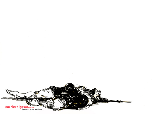
Bert Stern’s then experimental prints of Monroe were based on his now iconic photographic study of her shot at the Bel Air Hotel in Los Angeles in June 1962. Monroe was dead a couple of years later never having posed again for such an essay. Stern remained “preoccupied” with her though and created the stunning serigraphs authentically reproduced in AVANT GARDE some five years after Monroe’s death.


The twelve-page spread of Stern’s prints appeared in Issue 2, March 1969. The feature was entitled “The Marilyn Monroe Trip”, and brilliantly laid out on the magazine’s 11”x11” pages. Both the cover of the magazine and the serigraph reproductions were printed in a process known as ‘sheet fed gravure’ which was exceptionally well-suited for duplicating the multi-screen original serigraphs.


Announced in this issue was the magazine’s “NO MORE WAR” poster contest the results of which were published in Issue 5. Among the judges of the contest entries were photographers Richard Avedon and Edward Steichen, printmaker Leonard Baskin, sculpture Alexander Calder, and artists Milton Glaser, Robert Motherwell and Larry Rivers.


Also included in the March 1969 issue was the very cool fiction piece “The Visitor”, by Roald Dahl which first appeared in a condensed form in Hugh Hefner’s Playboy Magazine in 1965. Dahl’s short story was illustrated with drawings by Etienne Delessert whose distinctive, sometimes edgy and always clever graphic art ranks among the best of his day.


Issues of AVANT GARDE, fortunately, are not particularly rare today and can be found in used book stores and on-line, often, in the $10-$20 range for copies in fairly good condition. A value, I believe, not to be overlooked at these prices for the remarkable quality and enjoyment this cultural arts oriented publication will bring over and over again.

--Stephen A. Fredericks

Wednesday, April 20, 2011

Let Carrier Pigeon be the fly on your digital wall.

Remember the first time you saw all ten editions of Carrier Pigeon issue no. 2's hand-silkscreened covers glistening in front of you? Remember the turmoil in your gut as you carefully chose a favorite, counting out your milk money in a cold sweat?

As a show of thanks to all of our friends, supporters and contributors, Carrier Pigeon would like to offer up a series of desktop wallpapers created from these covers. Each image has been carefully augmented to look terrific within the screen ratios and sizes available to our digitally-yoked generation of laptop swindlers. This means if you download two sizes of the same cover, there may be surprising and delightful differences. The images below are thumbnails of the 1024 x 768 version of each wallpaper.

The dimensions listed below are in pixels. Click the dimensions that best fit your computer screen to view/download the corresponding desktop wallpaper image.

Click the artists' names for life stories, past histories and current mugshots. And if you like what you see, consider picking up an issue of Carrier Pigeon from our website or any of the stores that carry us. Issue no. 3 will arrive in late Spring.


Bruce Waldman:
1920 x 1200 | 1440 x 900 | 1280 x 1024 | 1024 x 768


Christopher Darling:
1920 x 1200 | 1440 x 900 | 1280 x 1024 | 1024 x 768


Denise Kasof:
1920 x 1200 | 1440 x 900 | 1280 x 1024 | 1024 x 768


Justin Sanz:
1920 x 1200 | 1440 x 900 | 1280 x 1024 | 1024 x 768


Kristy Caldwell:
1920 x 1200 | 1440 x 900 | 1280 x 1024 | 1024 x 768


Matt Barteluce:
1920 x 1200 | 1440 x 900 | 1280 x 1024 | 1024 x 768


Ray Jones:
1920 x 1200 | 1440 x 900 | 1280 x 1024 | 1024 x 768


Rie Hasegawa:
1920 x 1200 | 1440 x 900 | 1280 x 1024 | 1024 x 768


Russ Spitkovsky:
1920 x 1200 | 1440 x 900 | 1280 x 1024 | 1024 x 768


Stephen Fredericks:
1920 x 1200 | 1440 x 900 | 1280 x 1024 | 1024 x 768


Bruce Waldman (back cover):

Sunday, April 17, 2011

What is the equation for an interactive experience that sends you flying?

This screen grab from wired.com.


I was reading this article about an iphone game whose sole draw is that once the character dies, he is dead forever. Not even just for the game, but for the life of the application. The argument in favor of this kind of experience is that contemporary video games have become too easy and that having more at stake will induce real-life emotion in the player and so be more rewarding.

It's a compelling argument. The primary idea behind video gaming is catharsis, a purging of your troubles through a heightened emotional experience, like fear. Video games also provide sublimation by diverting pent-up emotions into an activity with no real repercussions (i.e. punching a robot in the face onscreen because you can't afford to raise your voice to your boss at work). 

On the other hand, one could argue that, especially in a time of such widespread economic uncertainty, the safety and "slap on the wrist" mentality of other video games provides exactly what people really want: a fantasy world in which no decision induces actual, stomach-curdling panic. At a time when a master's degree barely earns its recipient a place in line at the temping office, and mid-level expectations like yearly raises and vacation time—not to mention eventual retirement—are no sure thing for most of us, who needs contrived fear?

What do you think? Should entertainment involve your emotions or separate you from them?

Wednesday, April 13, 2011

History Lesson. Today's Subject? Playboy.


Louis Bouche: wood cut
As early as the 1880s American artist-driven publications merging fine art and literary content—most often poetry and etchings—began to appear, published by independent and established presses. Without exception these entrepreneurial ventures were defined by their original art content and popular writers. A successful market quickly developed which carried into the early 20th century and continues to this day.

Playboy—A Portfolio of Art and Satire, first published in 1919, was one such product. The magazine, originally intended as a quarterly, was edited and published by Egmont Arens. He printed the magazine himself at The Flying Point Press, 39 West 8th Street in New York City.


Vollaton woodcut La Paresse
Today, the remarkable “first Playboy” has all but been lost to time, save for the collectors of art and literature magazine publishing ephemera. Limited to only nine issues over the course of about four years, Playboy was a socially progressive and nearly radical publication in its day, known for including jabbing parody of the rich during the “roaring” 1920s. Associated with the magazine were artists of stature in their day and of renown today, including Georgia O’keefe, photographer Alfred Stieglitz, John Marin, Rockwell Kent, Hunt Diedrich and William Gropper. Among this group more than one was identified with sensitive political and social views of the day, and even homosexuality. Hunt Diedrich may best be best known, albeit anonymously to most New Yorkers today, for his public sculptures, which include the original art deco weather vanes atop the buildings in the Central Park Zoo and other public buildings.


Russian Woodcut: A Russian Workman
Issue no. 9 of the magazine, Arens’ last entry in the series, featured several original prints including a linocut by Louis Bouché, an engraving by Rockwell Kent, and an exceptional woodcut by an unidentified Russian artist: given the political climate of the day, it is likely the Russian artist was intentionally un-named. There were also contributions by activist publisher Hugo Gellert, artist Yasuo Kuniyoshi, and Joseph Stella. By this time the magazine’s advisory board included Carl Zigrosser, who would become one of the most famous fine-art print dealers in New York City history.
Issue 9 Cover: Ilonka Karasz
I


A copy of Issue no. 9 of Playboy—A Portfolio of Art and Satire on the open market will fetch $1,500 or more today. Any opportunity to peruse a copy of any of its issues should be taken. Given the similarity between the earlier editions and those published by Hugh Hefner some thirty years later it is clear Hefner held Aren’s effort in high regard.


Other pieces referenced in this post:

Illustrated Georgia O'Keefe article by Paul Strand
Hunt Diedrich: muse and sketches
This blog post is brought to you by Stephen A. Fredericks, CP contributor and PR master!

Thursday, April 7, 2011

Art and Technology. I'm torn. Kinda.

There is something I like about being in museums. The smell. The anonymity.

Most of all, I love being able to lose myself in certain paintings and artifacts. Sometimes, I get lost in the bubble on a thick-painted canvas or a certain thread sticking out of robe worn only by a 15th century nobelman. Nothing spiritual, more meditative.

Being able to clear your head has since, for me anyway, become more of an art that I didn't have time to master. It is very rare that I am not involuntarily multi-tasking or trying to keep up with my mind going every which way. So being in a museum, unable to watch TV, chat on my cell phone or concentrate other than what's in front of me was priceless but unfortunately an infrequent oppotrunity.

Image from MoMA.or
Bringing the iPad to the museum (although able to read every didactic with out having to stand on your tippy toes is great) would take away from only thinking about the materials and images in front of me. It seems awesome--being able to read even more about a piece of work or see what other people have to say about it (which, is nice because I like going to museums by myself but like to talk about things sometimes)--but I wouldn't be surprised if most people spent more time playing with the device and looking at the screen more than the 150 AD sculpture of a naked Italian dude in front of them.

OK, I'd probably turn the iPad off...after I Google what zodiac sign that animal represents.

Or maybe I wouldn't have ended up going at all and just spent the afternoon zooming in on a Monet on my couch with the dog.

Learn about MoMa iPad (and Android!) apps here:http://hyperallergic.com/22246/moma-catalog-ipad-app/ and here: http://www.moma.org/explore/mobile/abexnyapp (Deep Focus, the agency that pays my bills created this one).

Sunday, April 3, 2011

Popular art history is a strong swimmer.

No matter your personal feelings about Norman Rockwell, the guy was as obsessive a painter as anyone has ever been, especially considering the constraints inherent to the illustration game. On first appearance it seems as though he was content to paint ads for bread and tires and whatever else came along at the right price. And from the perspective of an illustrator in 2011, having the time to draw several fully-rendered studies before painting a 36-inch-tall finish in oil is a little mind-boggling.

But consider this: in the early 1960s he secretly entered a knock-off of a Jackson Pollock abstract into an art contest. He'd painted it in preparation for the final rendering of a drip painting featured as part of an illustration for a 1962 Saturday Evening Post cover, which you can see here.

He won first place. It must have been bittersweet to win over the fine-art establishment with a knock-off that, incidentally, had been entered under an Italian name, when a true Rockwell artwork, prominently signed and slaved over, couldn't get him in the front door of a gallery.

Sure, Rockwell primarily painted cheeseball, watering holes and puppies. We all get boxed into what people come to expect, and then demand, from our first successes. But he would have painted anything, tried anything. That, more than his apple-pie ornamented paychecks, is what makes him relatable now.

People took notice of Rockwell's toe dipping into modernism, and a magazine called Ramparts called him up with an unprecedented proposal. The slick, left-leaning publication, which published Che Guevara's diaries and trained staffers who in turn created other slick, left-leaning publications, such as Rolling Stone, (which is still, at least, treading water with admirable stamina) had an idea for Rockwell to create a "Saturday Evening Post style cover," then do some acid and paint it over again. It's really not surprising that this appealed to the Boy Scout of American illustrators: Rockwell's obsession with his work is well-documented. In his autobiography he describes the steps he took to curb his habit of overworking the heads of his subjects, occasionally painting drunk and even going so far as to paint with oversized brushes, then bricks, then half-shingles. Of the leftist magazine's pitch Rockwell said, "I thought it might be fun." But a concerned psychologist friend intervened, and the commission never happened.

The point is that illustrators are in the same boat we've always been in, stumping around at the mercy of art directors and editors and a branding perspective on the public readership. On Friday, April 1, Carrier Pigeon celebrated the closing of its issue no. 2 release exhibition at Sacred Gallery in front of a gratifying number of new faces. Among things worth celebrating is confirmation that a magazine where every artist and author has final say on his/her contribution—contributions, in this case, being synonymous with personal work—is not just a one-hit wonder. If you were a part of this event, we thank you. A special thank you also goes out to the authors who participated by publicly reading from their stories: Russ Spitkovsky, Ben Schaeffer and Matthew Blair.

If you missed the event, don't worry. Carrier Pigeon is printed quarterly. Keep your calendars open.

Sunday, March 13, 2011

NICK POPE PREVIEW


L.A. based writer Chris Stanton has contributed not just well-crafted stories to the first three issues of Carrier Pigeon, but also his quirky sense of humor. It is almost laughably ironic how I first met Chris, through a blog post (not dissimilar to this very one) five years ago.

In 2006 I posted the following on my blog: would anyone like to collaborate on an art project through the mail. Stanton was the first to respond and mailed me a package the next week. We have been mailing each other things ever since (books, artwork, stories, videos). We both love art and writing, and we both are huge nerds. Chris and I have never actually met in person.

Stanton studied dramatic writing at New York University, and received an MFA in screenwriting from the University of Southern California. As well as writing for Carrier Pigeon, Stanton is finishing up edits on his first Screenplay in Los Angeles. Stanton is also a contributing editor to Daily Du Jour.

About a year ago Chris mailed me what he called "Nick Pope" as asked if i would like to illustrate it. The story revolves around a high school student in 1987 who is basically an outcast struggling to find identity and belonging. The 140-page hand-written and illustrated diary is nearly ready to show it to publishers in New York.

This is all a testimony to what can evolve from a simple blog post and begs the question: Can a blog post actually change your life? Well, if a blog post cannot change you life, maybe the second issue of Carrier Pigeon can.